Better glyph consistency update
In preparation of a big update that’s coming soon (or not!), I just released a maintenance update for the Condensed and Condensed Mini fonts. I believe both fonts are now more consistent.
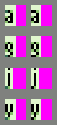
Pixel colours in termination of strokes
In the first iteration of the design, I used the dark green colour at the end of strokes in some places. After reviewing the glyphs, I realised the use of it was inconsistent and didn’t bring any value. So I fixed it with a black pixel.
Here are some examples of glyphs affected by this change, before and after:
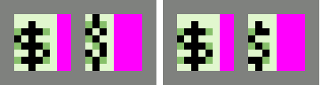
Glyph redesign
Some glyphs have been completely redesigned. The $ sign is now modeled after the capital S consistently across both fonts.
Here’s how it looks in both fonts, before and after the redesign:
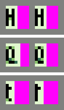
Minor glyphs updates
The appearance of other glyphs has been slightly altered. Here are a few examples:
- The horizontal bar of capital H matches the height of the one in capitals B, E, F…
- The uppercase Q is narrower, thus saving one pixel in width.
- The bottom of lowercase t is now straight rather than curved.
Some of these glyphs before and after:
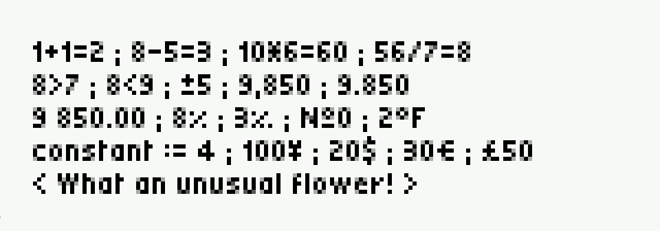
Signs alignment
The alignment of some glyphs, mostly relating to numbers, in Condensed Mini font has been reviewed. In some cases, the glyphs were misplaced and thus hard to read (for example the degree sign).
This is a sample of numbers and signs that I used to verify consistency:
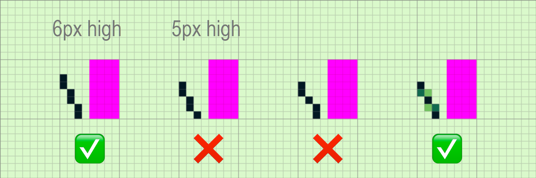
Subpixel rendering
One of the features of this font set is the use of the 4 colours of the Game Boy palette to achieve enhanced readability. This new update makes use of anti-alias, or subpixel rendering in more glyphs.
But what is it? Let’s say you want to render an oblique line, like a slash, on a 6 pixel high grid (like the one used in Condensed). This is fairly easy, just make a vertical line where the position of every 2 black pixels is shifted by 1 pixel to the right.
Now imagine you want to design the same glyph on a 5 pixel high grid (as used in Condensed Mini). You won’t be able to get a harmonious line. There will always be a single pixel isolated with groups of 2 pixels. This design breaks the flow of reading and the line looks wonky.
The way out of this problem is to use subpixel rendering. The idea behind this method is to pretend that black pixels can be positioned halfway (or split) between 2 pixels on the screen grid. If you shift a black pixel by 0.5 pixel to the right, you end up with 2 pixels of different colours. One part of the pixel rendered on the left pixel and the rest on its neighbours on the right.
It’s a bit difficult to explain with words, but this image should hopefully make sense:
And comparison of some glyphs using this technique:
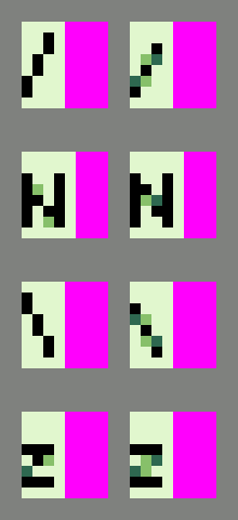
Now, this technique may not be proper subpixel rendering if you’re a purist, but this term is close enough to what is described here.
I’d love to hear your feedback on this new release in the comments below. Let me know the games you are building with it!
Note: The comparison images were created using my free GB Studio font tool. Make sure to check it out!
Leave a comment
Log in with itch.io to leave a comment.